

Happy New Year everyone! Of course, I recently wrote 2022 on a check. The fact that I still write checks is a hint that I’m baffled by the quick turn of years. For the first few Data Digests of 2023, we will be using GIS (Geographic Information Systems) for a local dive into some basic economic indicators. Today we concentrate on household income indicators. We will look at Average Household Income and Median Household Income at the Census Tract level, and then examine the relationship between them.
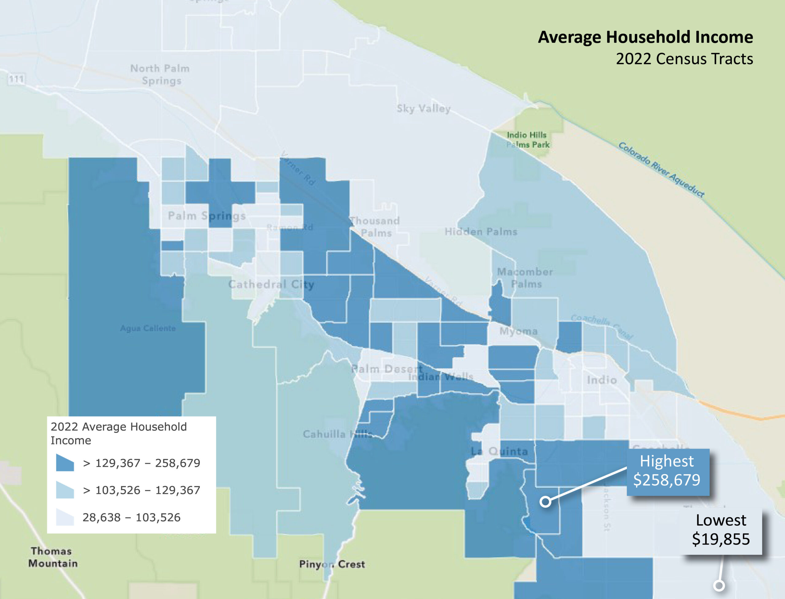
Most of us understand averages from middle school math. To determine average household income, we sum the income of all households in a chosen geographic boundary (in this case, census tracts) and divide it by the total number of households. If income were equally distributed to all households in the tract this is the amount it would be. Note that this is not individual income but the total income of everyone within a household. So, this considers dual-income households, multigenerational households, etc.
And what a range we find in the Coachella Valley – from a low of $28,638 in the Mecca area, to 258,679 in nearby La Quinta. The numerical breaks in the income levels are intentional. $103,526 is the overall average household income all the Coachella Valley. $129,367 is the overall average household income for California. The US average is $105,029. Even along the “spine” of Highway 111, we see a considerable disparity in average household incomes.
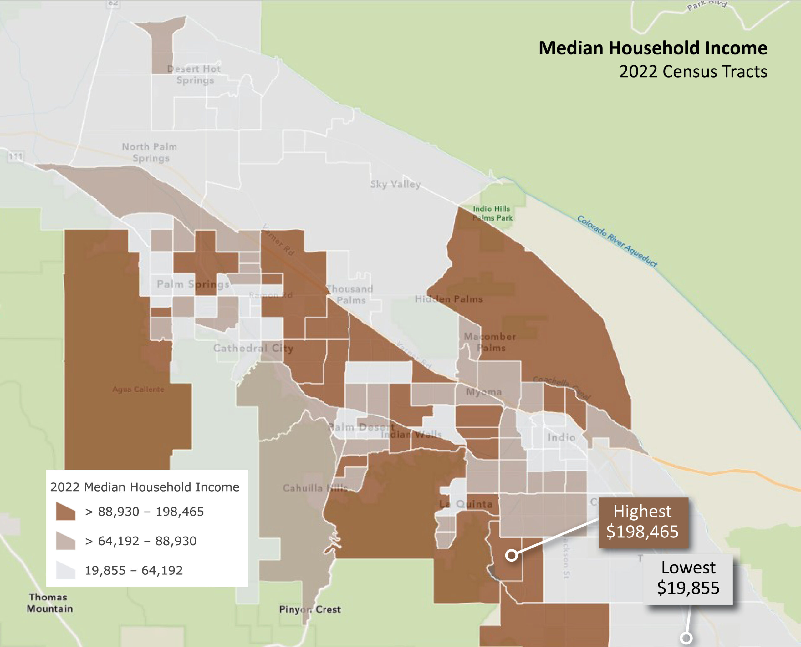
Median income is a bit more complicated than the average income. Here we determine the household income amount where half of all households have incomes above the median income value and half below. Once again, we see wildly ranging income disparities with similar extremes located in the southeast of the valley. Think about this. Half of the households in a Mecca area tract have incomes less than $19,855 but nearby we see a tract where half the households have incomes above nearly $200,000.
We often see these income variables reported separately. But comparing them reveals much more than looking at them independently.
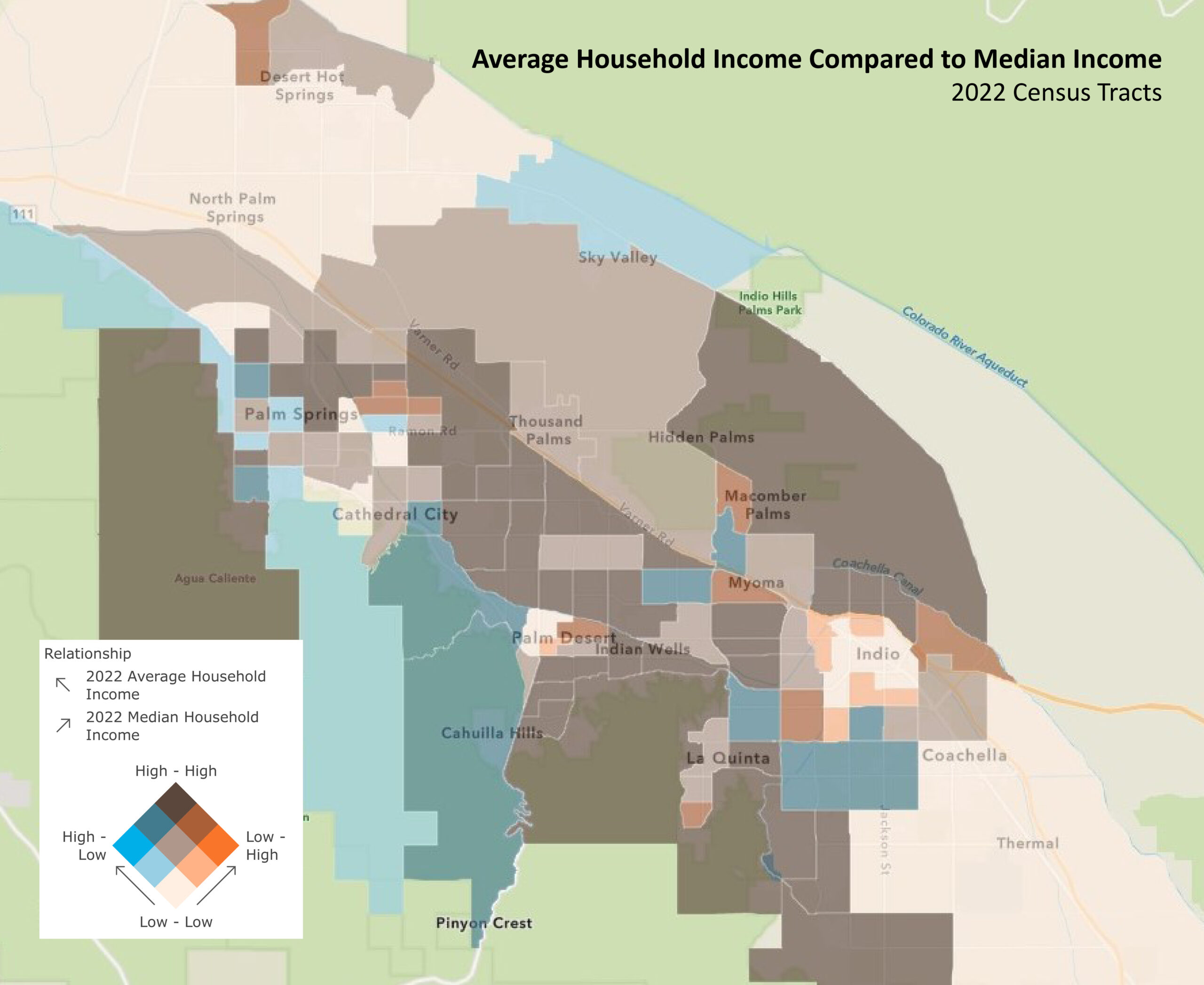
This map uses a cartographic technique that allows one to map two variables simultaneously. If you look closely at the legend, as you move up to the left on the graphic cube, the average income gets higher (darker blue). If you move up to the right median income gets higher (dark orange). But when both variables are high you get the dark blue/brown colors.
When you see tracts with more blue shades that means average incomes are high, but median incomes are relatively lower. And the orange hues mean that median household incomes are high but average incomes are relatively lower.
Average incomes higher than the median often means that a small number of households with very high incomes skew the average. In a tract where the average income is $100,000 but the median is $50,000, the household “in the middle” (and every household below) makes half the average income of the tract. So, when average income does not have a classical bell curve or symmetrical distribution, it is best to look at the median income as well.


