

Disasters disproportionately affect individuals and households. As we have learned over these past 2 plus years, the adverse effects of COVID-19 correlate with particular individual and household attributes. Fires, heatwaves, flooding, and the like affect populations differently. The US Census launched the Community Resilience Estimates to track communities typically at-risk during disasters. Today’s Data Digest maps such risk here in the Coachella Valley.
As the Census states in its Community Resilience project, “some groups are less likely to have the capacity and resources to overcome the obstacles presented during a hazardous event. Resilience estimates can aid stakeholders and public health officials in modeling these differential impacts and developing plans to reduce a disaster’s potential effects.”
The risk factors used in the Community Resilience model include these characteristics from the American Community Survey (ACS)
- Income to Poverty Ratio
- Single or Zero Caregiver Household
- Crowding
- Communication Barrier
- Households without Full-time, Year-round Employment
- Disability
- No Health Insurance
- Age 65+
- No Vehicle Access
- No Broadband Internet Access
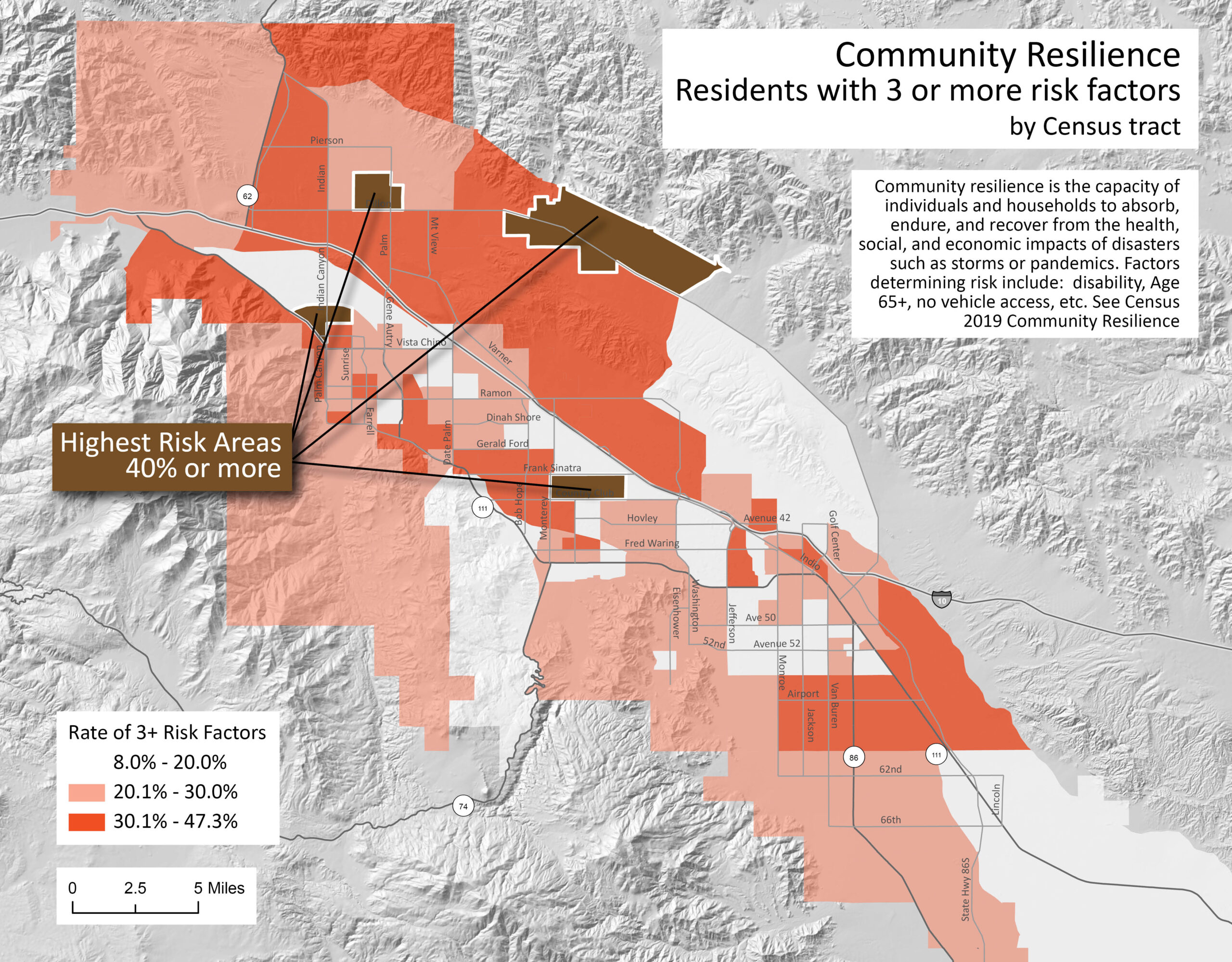
This first map shows the population of the valley that has 3 or more of the risk factors listed above. Each census tract is color-coded to show the proportion of residents with these factors. Note that tracts with 30% or more of residents with these characteristics are spread throughout the valley. This population exists within each of the 9 cities.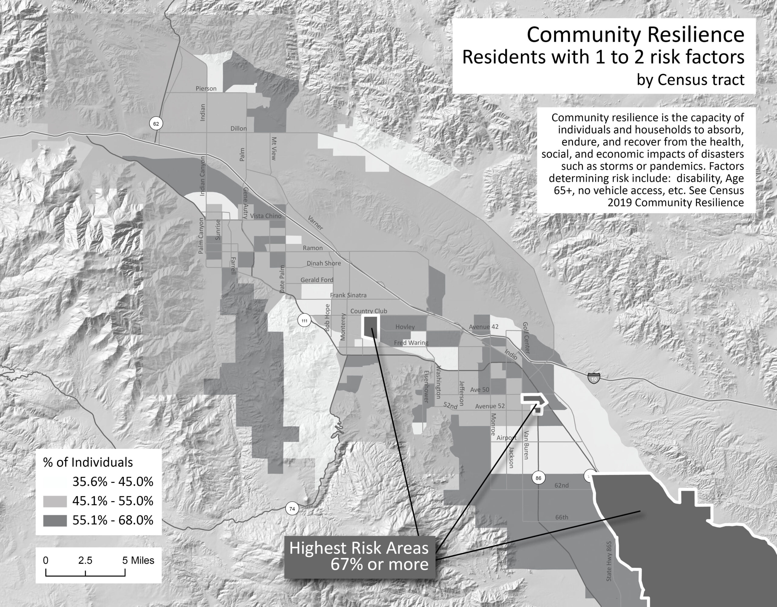
A higher percentage of residents of the Coachella Valley have at least 1 to 2 risk factors for resiliency. In four tracts, over 67% of residents would need special assistance during a disaster
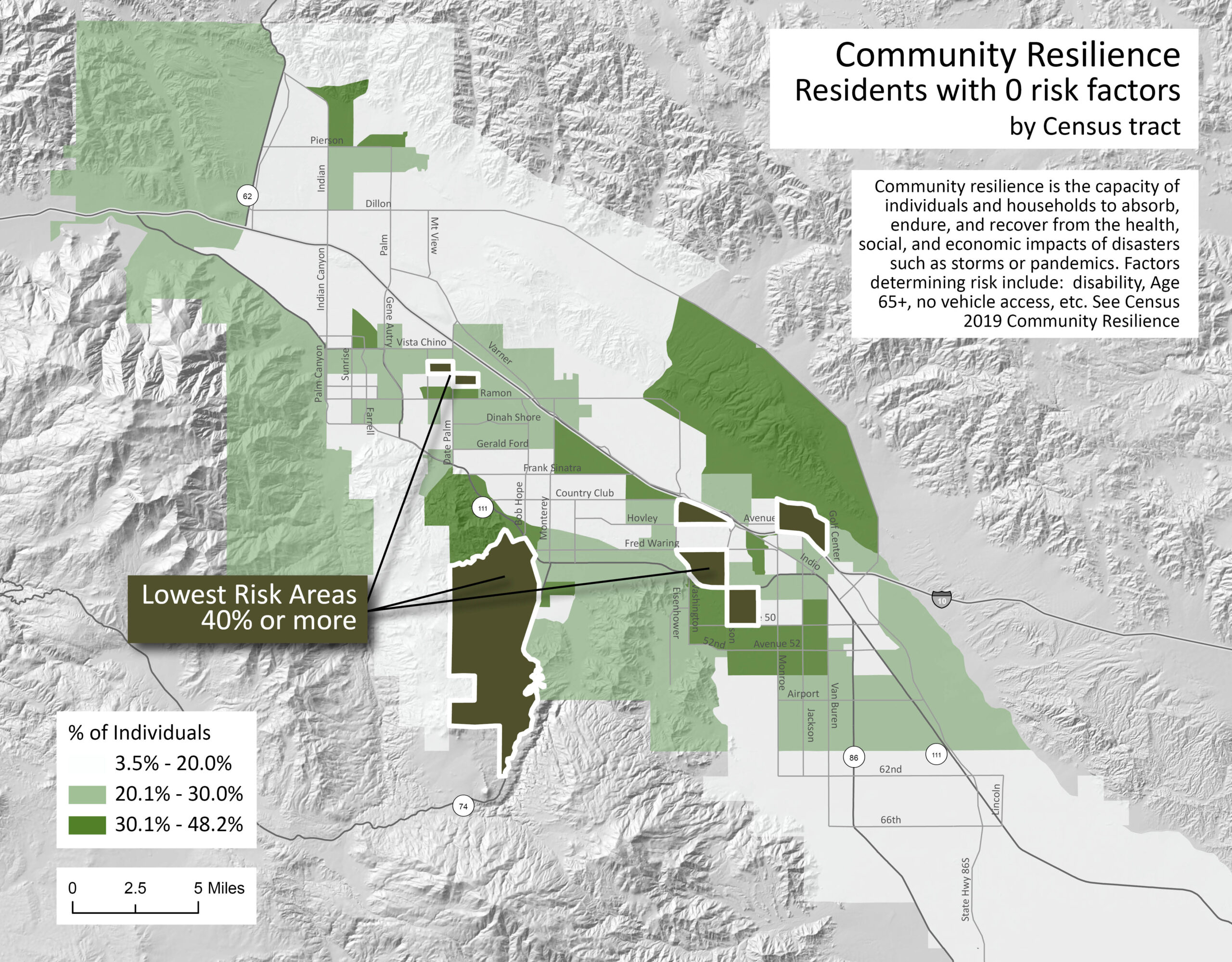
And we conclude with a map that shows the tracts with the lowest risk of adverse effects from disasters. In this map, we see an inverse of concentration. The darker areas are tracts where the resident population has none of the risk-factor characteristics listed for Community Resilience.
In each tract, if you added the three percentages of the various risk categories, it would add up to 100%. Pick a tract near your home or work and see the proportions of risk on each map. You might be surprised to see some more affluent tracts having rates of high risk, but some of these have high concentrations of 65+ populations or disabilities.
The data for these maps is from 2019, so they give a snapshot of a community’s relative risk before COVID-19. Soon, the Census will update its model with data from the 2020 Census. This will give us a chance to review our preparedness for the next disaster, one that we hope is long away.


