

We don’t want to get too esoteric or specialized for most Data Digests. There are no maps about the average consumption of organic hotdogs per household here (although we would be happy to share the data if you’re interested). Still, Geographic Information Systems modeling techniques offer a dizzying array of data aggregated to usefully small geographies like Census tracts or zip codes. And when you are willing to pay for data derived from an expansive collection of sources like social media, cell phone, and credit card transactions, we can map just about anything you can think of. Today’s maps utilize such data – Esri’s Business Analyst Online Data. Today we are looking at locations of households in the valley who dine out more than the average US household. Knowing where such households reside can be invaluable to locating potential restaurants or focusing one’s marketing efforts to reach such households.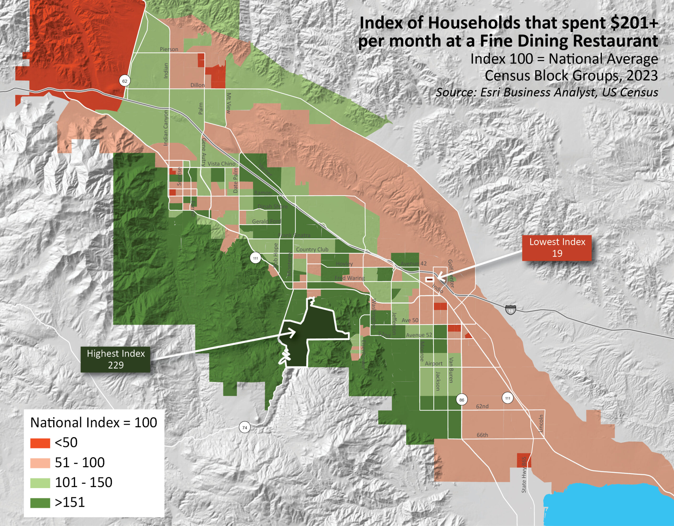
This map displays an Index of households that spend a minimum of $201/month at Fine Dining establishments. Green areas (Census block groups) are places with concentrations of households that frequent such restaurants more than the national average. And the darkest green areas have more than 1 and 1/2 times more households that spend that minimum amount. That’s a good many areas. Of course, in many of these one finds high-income households. The highest index area in southern Palm Desert has 2.3 times the number of households when compared to the national average. By contrast, a small block group near downtown Indio has only approximately 20% of households with such spending compared to the whole US.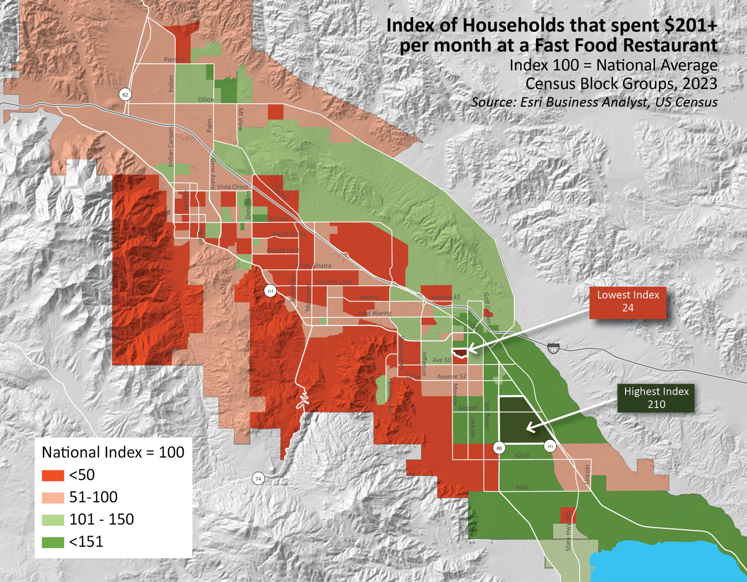
Now compare the previous map with this one – an index of households who spend a minimum of $201/month at Fast food restaurants. We expect to see a reversal of colors. Green ones are now red, and vice versa. Surprisingly, the highest and lowest index areas are not that far distant on this map.
When color-coding data on a map, we often look at three types of measurements- the total amount (e.g., total households), the percentage (how many households per all households), or an index (how does the area compare to a larger, comparative geography). While it can be very useful to have the total amount of a measurement, to give perspective, it can say little about how it compares with other areas. Of course, an area with a large population is most likely going to have more of something you are measuring than one with a small population. To make like comparisons, we normalize the data – divide a measurement by the total, or by a geographic unit like area (as in population density). And an index gives us even more insight in that it allows us to ascertain a measurement as compared to a larger population.


