

The tragic Los Angeles wildfires will undoubtedly shock our already strained affordable housing crisis in California. We will watch to see if a measurable number of those unfortunate households who lost everything will come to the Coachella Valley for a new start.
I’m afraid, however, that this tragedy will only exacerbate the problems of housing for low-income residents in the Valley. As in the rest of Southern California, wages have fallen drastically behind what is needed to own or rent housing. Many young people and the working population must share housing.
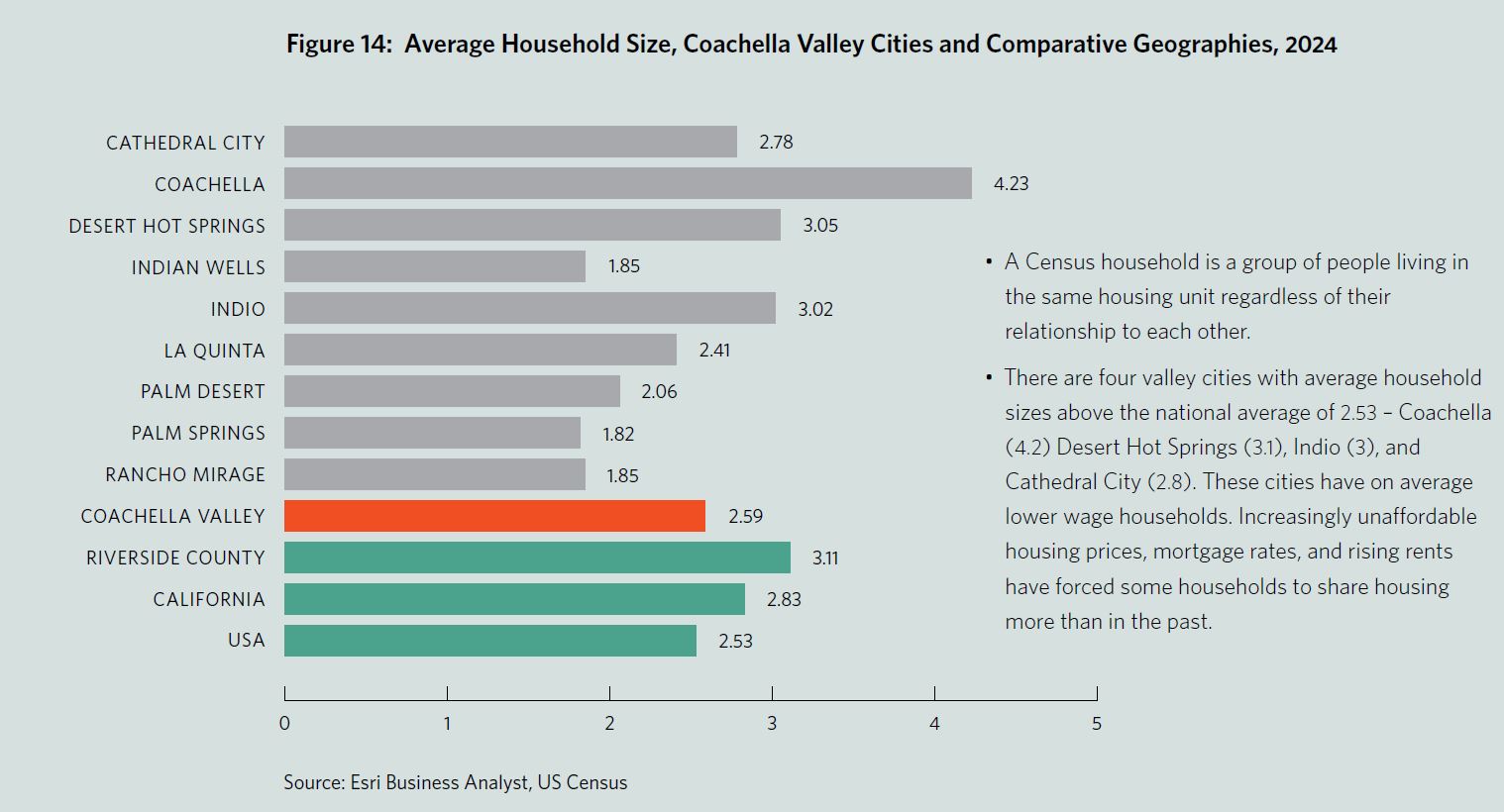
For my Data Digest this year I hope to contextualize data from our 2024 Greater Palm Springs Economic Report. Below is a figure from this report (page 25). It compares the average household size in the nine valley cities and the Coachella Valley as a whole and compares them to Riverside County, California, and the US. Our valley, as usual, is bifurcated between communities with characteristics below the national average and those above. We have four communities – Cathedral City, Indio, Desert Hot Springs, and Coachella, with larger average household sizes than the US average.
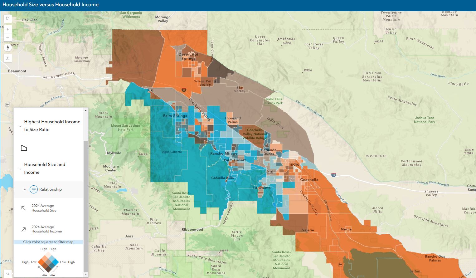
I have created a web map application allowing the user to look at household size and household income at a much more granular level. Here the data is presented at the Census block group level, the second to smallest census geographic boundary. I have symbolized the block groups based on the relationship between two variables – average household size estimates for 2024 and average annual household income estimates for 2024.
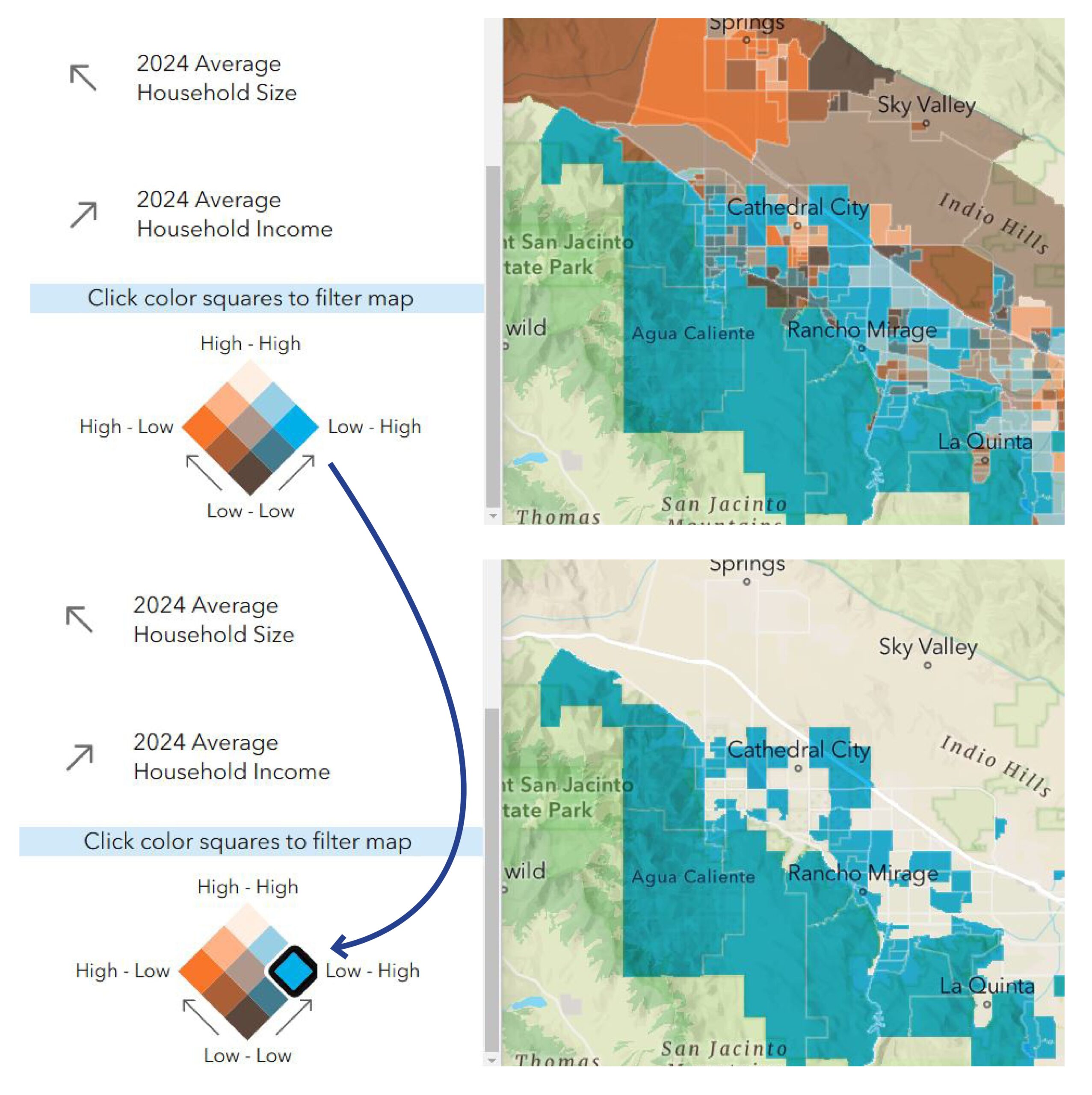
It may take several passes and a little time to understand the symbology represented by this tilted cube. The bottom of the cube, the dark red/brown, symbolizes census block groups with small average household sizes and low household incomes. The orange square to the left represents block groups with large average household sizes but low household incomes. The light beige square at the top of the cube represents block groups with large household sizes and high household incomes. Finally, the blue square on the right represents areas with small household sizes but high annual income. When you move up the cube on the left-leaning axis, household sizes rise. When you move up the opposite right-leaning axis, household income rises.
Web maps are interactive and thus allow the user to investigate on their own terms. In this application, the legend is even interactive. You can click on any of the nine squares within the cube to isolate only those block groups with that combination of attributes. In the lower right map, only the block groups symbolized by the darkest blue are shown, those block groups with low household sizes and high incomes. When you are finished filtering, click the Relationship button in the legend to reset the symbology to show all the block groups.
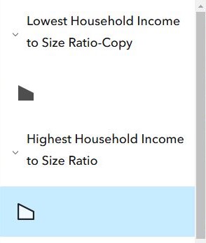
I added two additional layers to this map. You can turn them off and on by clicking on them in the legend. If the layer is on it will be highlighted in blue in the legend, as seen above. I created a ratio of income to household size as another comparison between the layers. A block group in Mecca has the lowest ratio between income and household size ($27,043/4.24 = 6,378) meaning households here on average have large households but low incomes. In comparison, the block group in Indian Wells has the highest ratio between income and household size ($293,351/1.85 = 158,568)
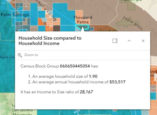
When you click on an individual block group, a pop-up panel will show you the household size and income variables along with the income-to-size ratio.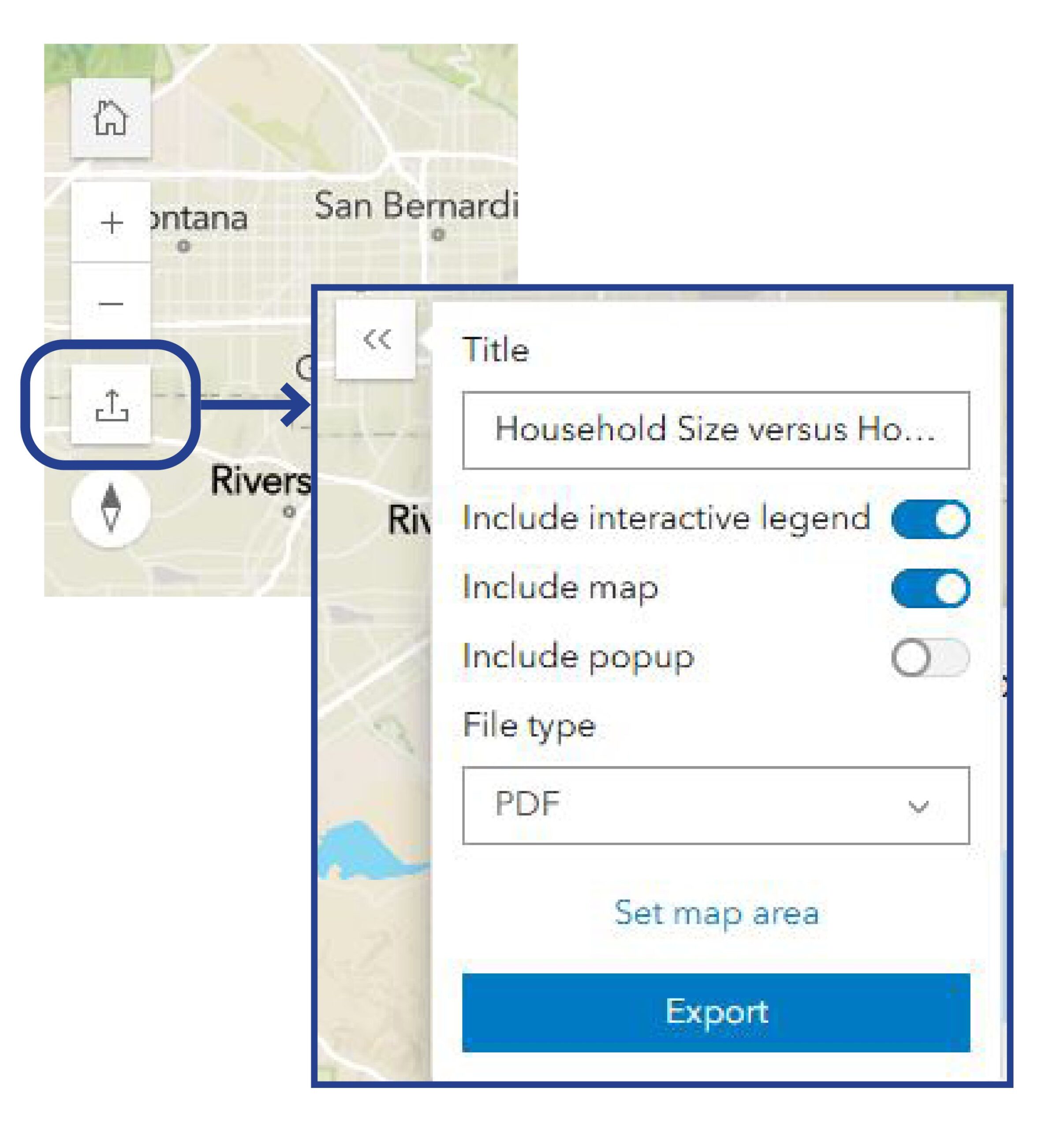
You can export your map (perhaps you have turned off certain layers or filtered for certain size and income comparisons) by clicking the Export to PDF button. Exports can be PDF, JPG, or PNGs. Click the “Set map area” button and, using the red cross hatch, draw a rectangle around the area of the map you want to print.


