

As a nation, we have many, many conflicting opinions and beliefs about the state of the American economy. One fact cannot be refuted, however. Employment in the US continues to rise, albeit at a recently lower rate. Today’s Data Digest shows a map of where the working-aged population resides in the Coachella Valley and how many of them are employed.
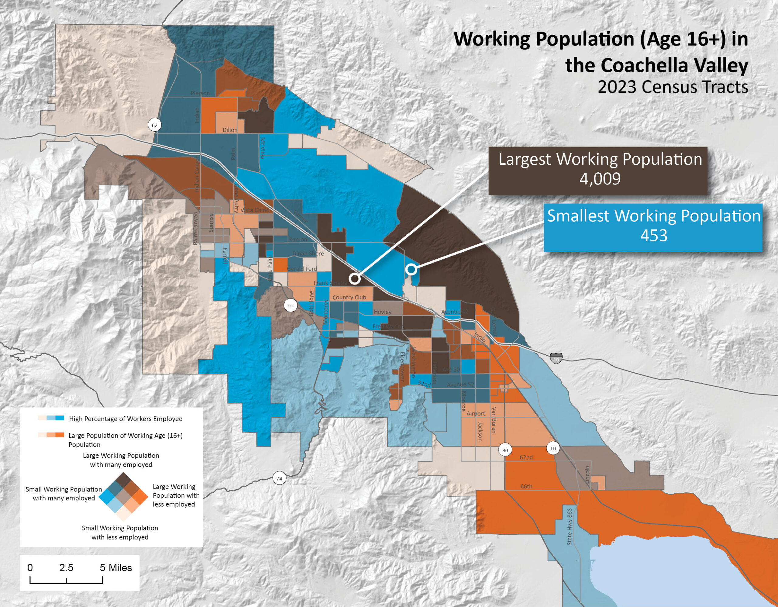
It may take a minute to understand the symbology of this map. Here we are mapping two attributes of employment. For each census tract symbolized, orange represents the size of the working population (i.e., the proportion of the population that is old enough to work – 16+) with lighter orange symbolizing a smaller working population. The other symbology in blue represents the percentage of the employed working-age population. For this symbology, no numbers indicate the magnitude of each attribute. Rather, we are mapping the coincidence of each attribute. If you look at the titled color box in the legend, the size of the working population is represented in intensity from the bottom towards the upper right, with dark orange meaning the largest working population. From the bottom to the upper left is the proportion of that working population that is employed. By “mixing” these colors you see where both attributes are high, or both low, or somewhat mixed.
Census tracts are devised to have an optimum size of 4,000 people. But they can vary between 1,200 and 8,000 people. However, these wide variations usually occur in more rural areas. So in a map like this of a more urban area, variations in the size of the working population are instructive. We can easily see the spine of lighter orange areas where less of the employable population is employed.
This is not a map showing the unemployment rate. The unemployment rate measures the number of people who are actively looking for work but not employed. It does not account for the many who have left the workforce completely. By contrast, this map shows the ratio of those of working age to the percentage that are actually employed. On this map, the mean percentage employed is 93.1% and the median is 93.6%, meaning approximately 6.5% of the population that is of working age is not employed. Compare that to the recent Riverside County unemployment rate of 5%.


