

It’s that time of year again for CVEP staff. We’re busily preparing for our annual Economic Summit. The summit is going to be a little different this year. With renewed energy, new leadership, and the celebration of 20 years of the Summit, we have some exciting changes and initiatives to share. We encourage all to attend.
The 20th Summit has me feeling a little nostalgic. What were things like twenty years ago when we introduced the Summit? Expect some fun economic recollections in this year’s Summit Report. And speaking of fun (at least for a map/data geek like me), I’ve been diving into a new economic dataset made possible by the generous partnership of Visit Greater Palm Springs. We’ve always been challenged to find reliable industry and wage data specific to the Coachella Valley. This new data partnership allows us access to region-specific economic data aggregated from many sources. And because it is statistically aggregated, these data are more current than those from individual government agencies.
Unfortunately, these data go back only 10 years. But they still give us an insightful snapshot of how our Valley industries and occupations have changed over a decade. 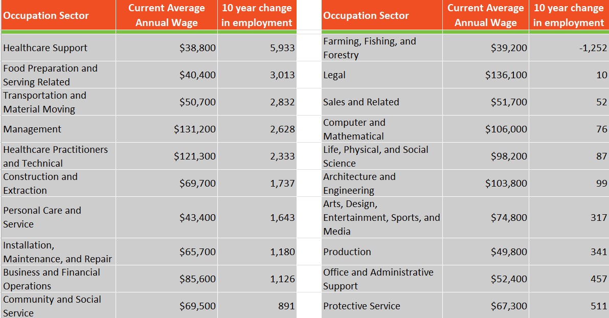
These 2 tables show the top 10 occupation sectors in total jobs gained and those that lost jobs or had modest gains since 2014. The wage data is the average wage for the occupation sector as of Quarter 1 2024. The top two sectors for jobs gained represent the Valley’s two primary employers – Healthcare and Hospitality. Many of the specific occupation sectors within these top industry sectors are predominately low-paying, though the fourth and fifth highest gains are in occupation sectors that pay well.
Except for the farming occupation sector, the lowest 9 occupation sectors still had modest gains. The drop in farming jobs most likely represents automation and consolidation in the industry. We saw only modest gains in some well-paying sectors like Architecture and Engineering.
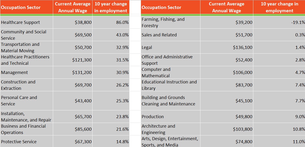
Instead of just looking at total jobs lost, we should also look at percentage gains and losses, accounting for the relative employment within each sector. Compare the two tables above with the previous tables. You’ll see a reordering of the occupation sectors and a few new sectors.
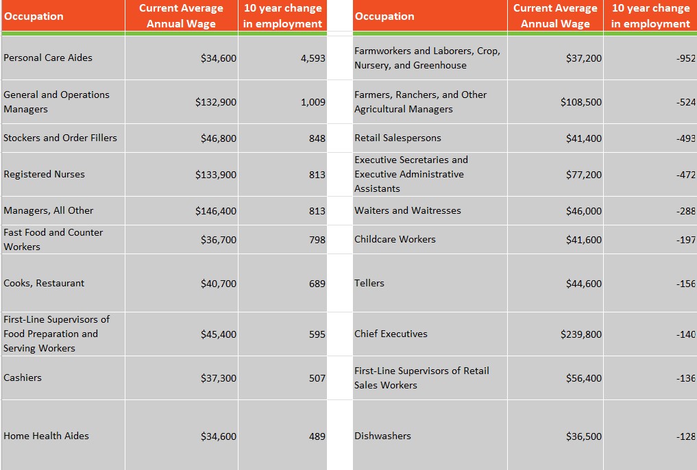
What’s really exciting is that we can now obtain very granular data down to the 6-digit SOC code. The Standard Occupational Classification (SOC) code is a federal code that categorizes occupations based on job duties. The code is organized by occupation sectors (e.g. Healthcare Support) and describes 868 detailed occupations. So in these tables, we see the top ten occupations in the valley, not the overall industry sector. Note that many of the top 10 gains in employment were in generally low-paying occupations, regardless of industry.
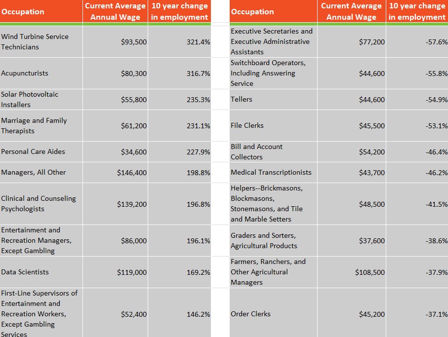
Again, we need to look at percentage gains and losses in comparison. These data expose some big changes in employment this decade. Green energy saw a surge in employment. This decade also saw the expansion of the casino industry. And look what automation has brought – a big decline in assistants, switchboard and answering service employees, tellers, and transcriptionists. With AI exploding, what will these tables look like in 2034?


