Presenting at our 20th Annual Greater Palm Springs Summit was a real thrill and honor. Thanks to all of you who attended. It was my hope and intention to share with you the intrinsic challenges and opportunities in gathering local economic and demographic data for our Valley. Our 84-page 2024 Greater Palm Springs Economic Report is available for download now. The report covers subjects from Household Income to Educational Attainment. Even if you are not a fellow data geek, I encourage you to take a look. I guarantee you will find useful and informative information you didn’t even know you needed or wanted!
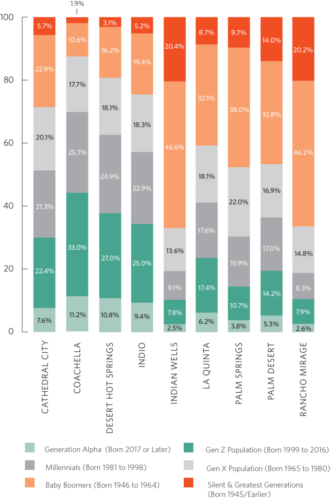
Here is a good example of a chart in the report. On pages 24 and 25 you will find two figures. Figure 12 compares the distribution of the generations in the Coachella Valley to those of Riverside County, California, and the US. The chart above, Chart 13, compares concentrations of the generations between the nine incorporated cities of the valley. Note the great variability of Baby Boomer predominance amongst the cities. In Indian Wells, 46.6% of the population are Baby Boomers, compared to only 10.6% in Coachella.
Under the leadership of our CEO, Laura James, CVEP is developing a comprehensive Strategic Plan. Making our data and analysis more accessible is one of the goals of the plan. Today’s Data Digest presents a preview of that goal. Here, we have taken the data from our written report and shared it in a detailed, interactive mapping application. With such an application, you can “dig in” to the data in much greater detail, and create and save your version of the map in the Atlas application. Below, I will show you how to use many of the features of the application.
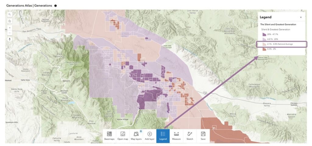
Opening the Generations Atlas application first presents a color-coded map of the Silent and Greatest Generation. Each color indicates this generation’s concentration within each Census Block Group (e.g., Boomers). The map opens with the legend visible. Each generation has specific data value breaks (e.g., 4.81% – 20%) based on its distribution. Each generation’s map has two colors – one to indicate “above the national average” and one below. This gives the reader a quick view of areas that have more of this generation than is typical in the overall US. The darker the color, the higher the concentration of this generation within the Block group.
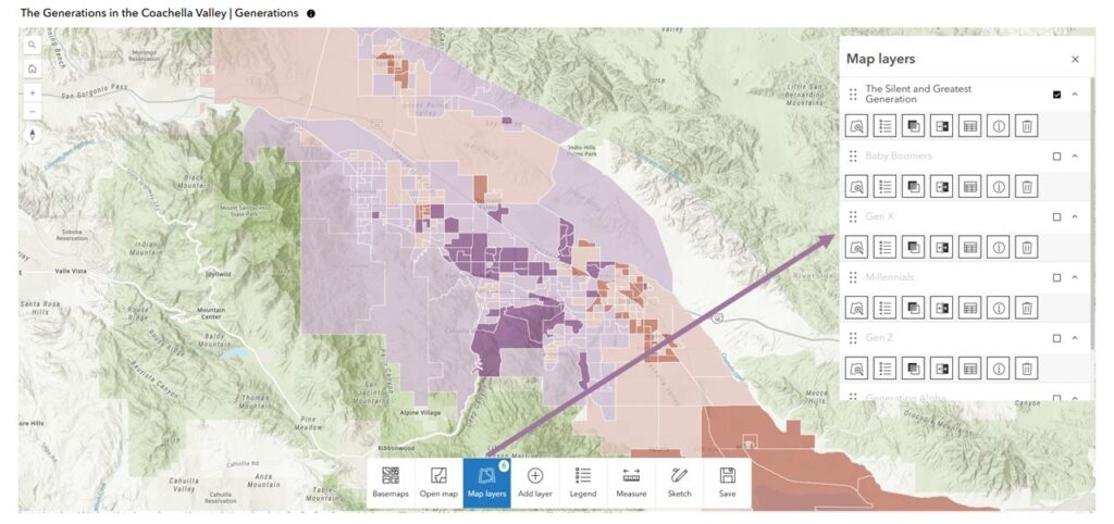
Clicking on the map layers button opens up a pane from where you can turn on and off the other generational layers.
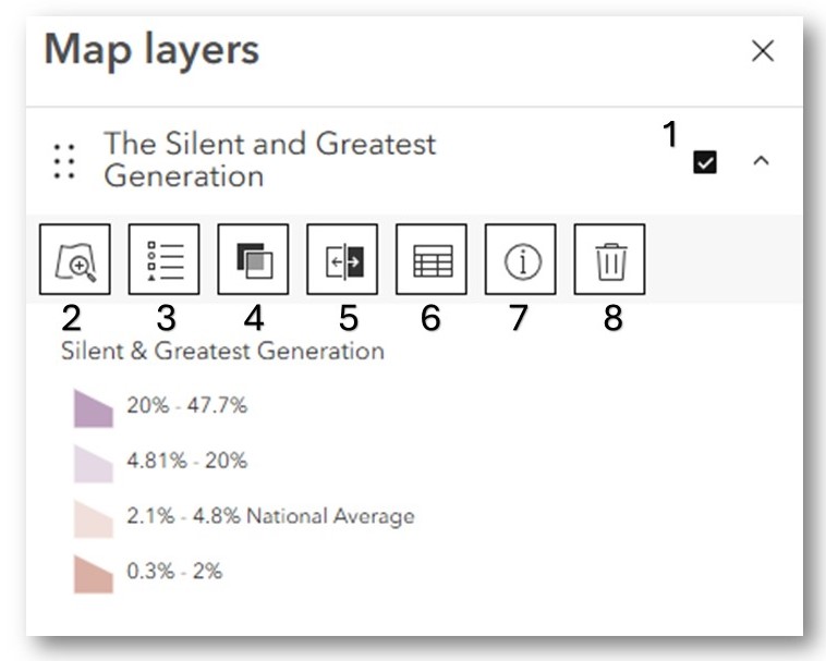 The Map layers pane gives the user control of certain features of the layer.
-
- Turn on/off the layer
- Returns the map to the full extent of the Coachella Valley
- Turns on/off the legend
- Changes the transparency of the layer
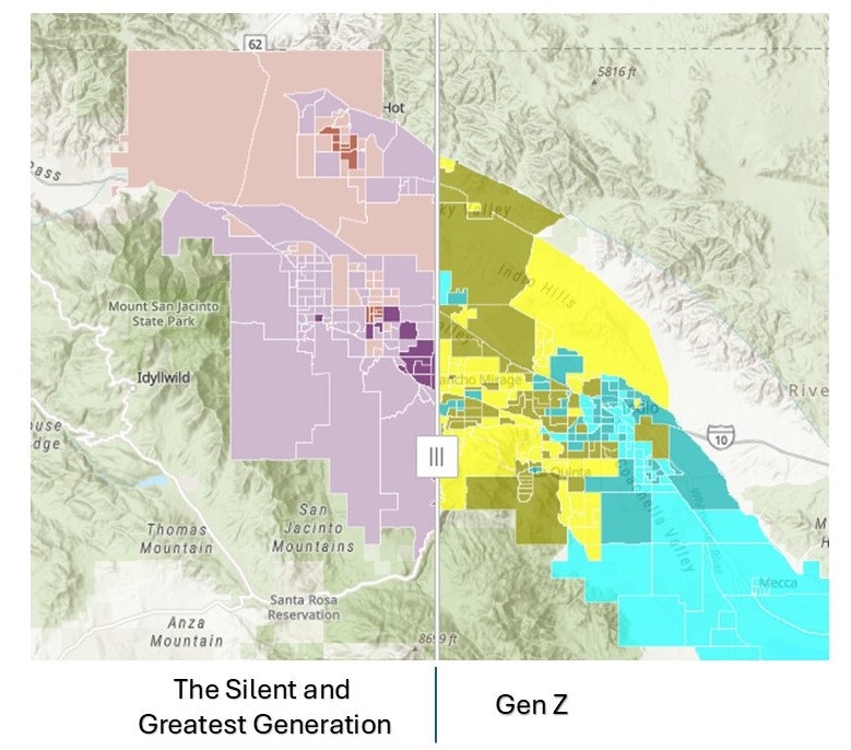
- A fun feature! Allows you to swipe between two layers that are turned on. The first layer that is turned on below will be the right-hand layer in the swipe.
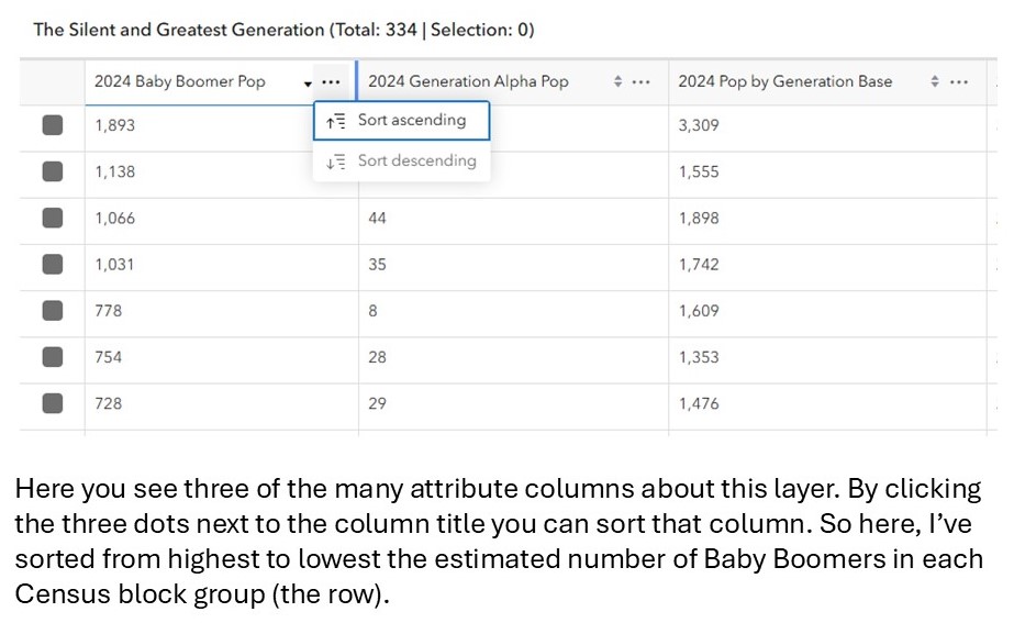
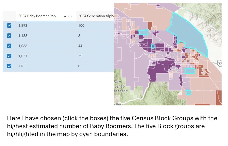
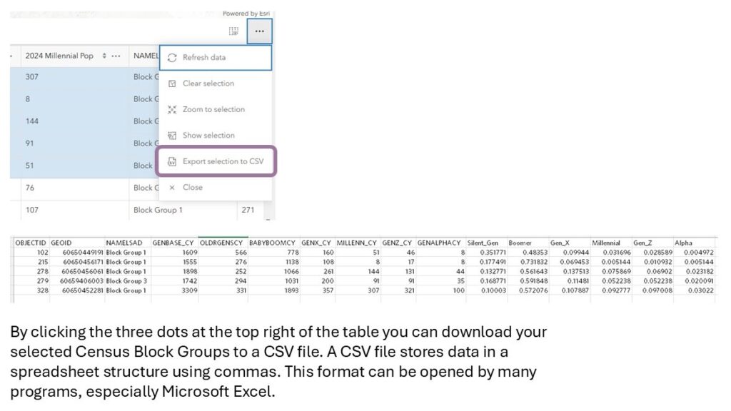
- Access the data table. All GIS layers have accompanying tables called “Attribute tables” that give values for each column. Each column represents an attribute about the specific row (in this case, a specific Census Block Group).
- Click to get a more detailed description of the layer
- Click to remove the layer from your map
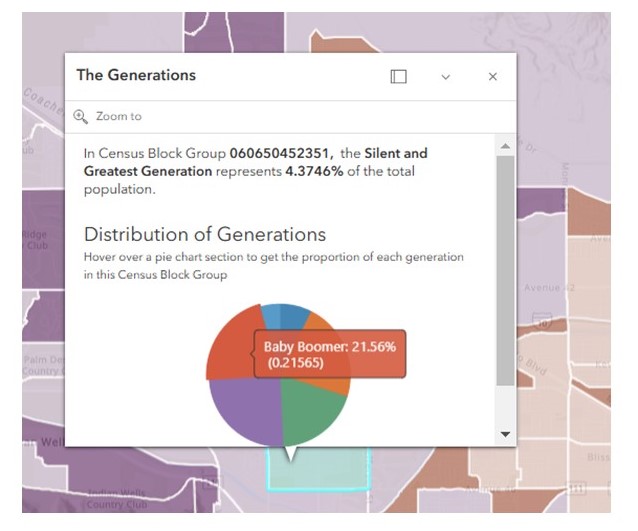
Click a Block Group on the map to activate a pop-up panel. The panel displays the percentage of the generational layer you are exploring, as well as a pie chart presenting the proportions of all the generations for the chosen Block Group.
Have fun exploring this map. We have exciting plans for 2025 to make much more of the content in our Summit Report available in interactive, highly detailed map apps such as this one.

